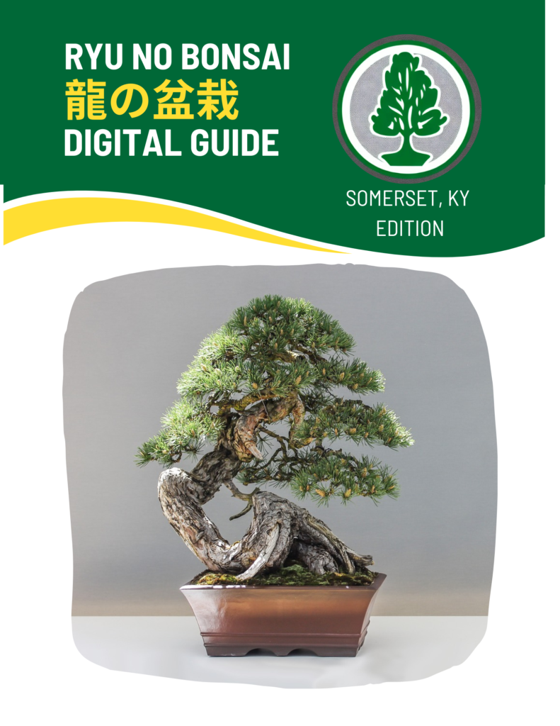
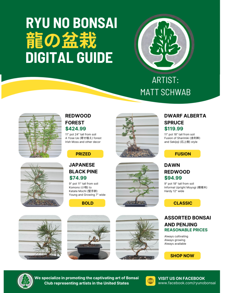
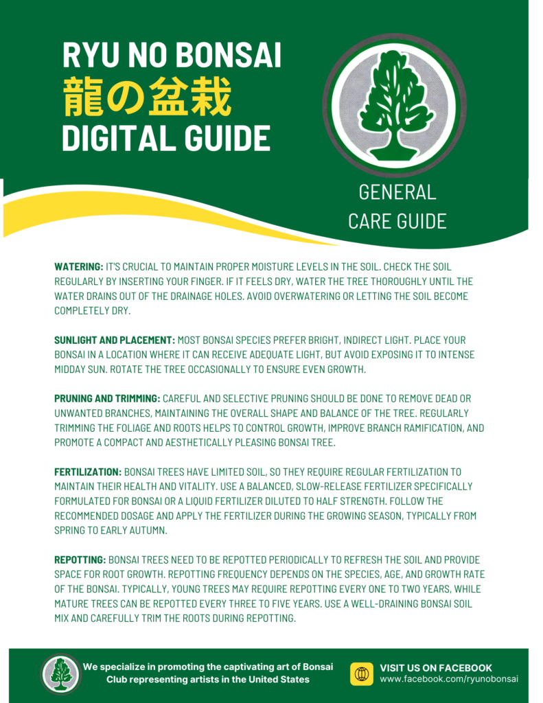
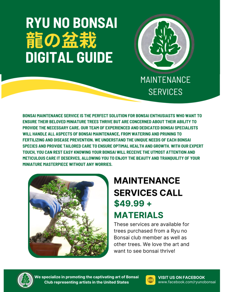
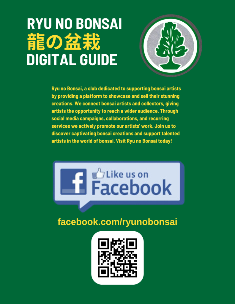
This is a design project that was a digital asset designed to look like a physical design with “bleed space”. I’m most proud of the typography choices and the sans serif consistency between the English and Chinese characters. The simple logo keeps that typography trend by being solid, gently curved, and cool in color (as opposed to warm).