A few years ago a friend who knew I was studying User Experience Design asked me if I could make an app for his radio station. He had just converted to a digital signal (I’m not familiar with radio technology, I’m a designer, that’s just what I was told) so he was finally ready to put his station online and wanted an app to support it. Well, I’m not an expert in backend coding but I did make some graphic assets for his project.
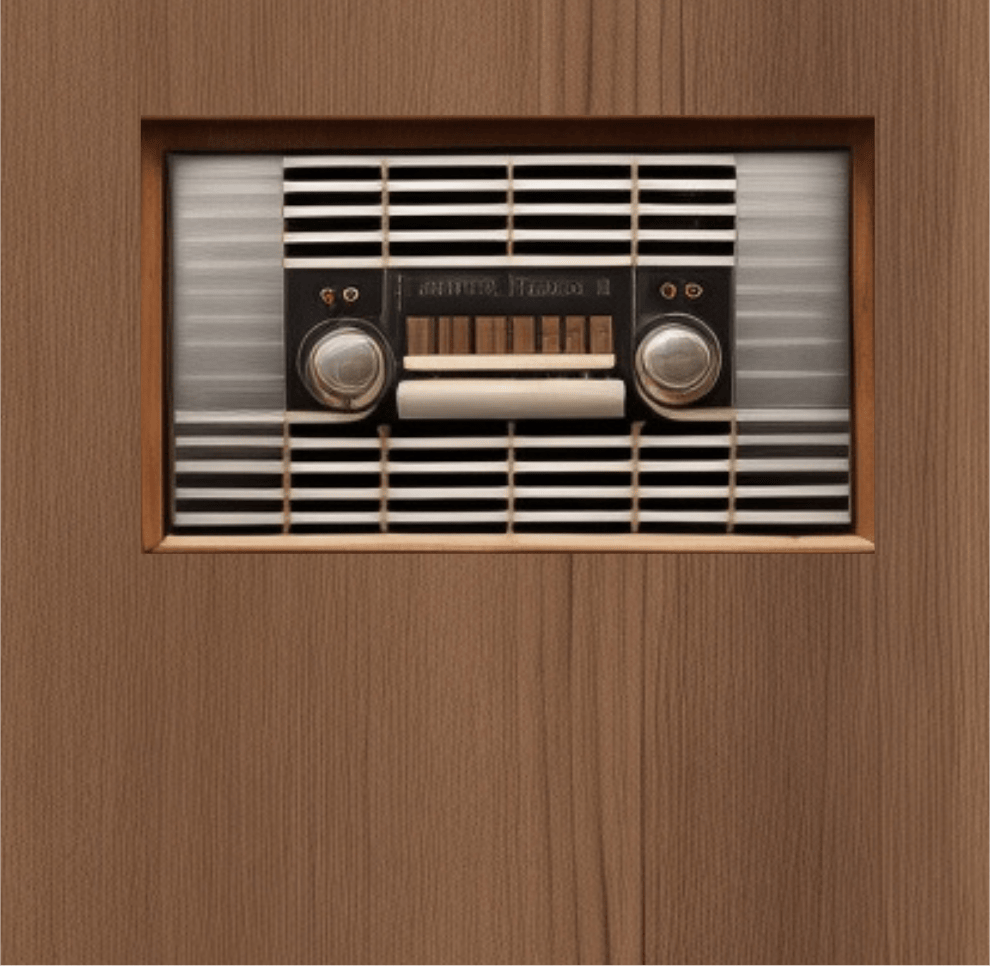
This is before AI image generation took over everything and back at this time Dall-E (eventually Craiyon) was the only option for generations. Those who remember probably remember just how terrifyingly bad Dall-E was at generating and understanding your prompts. But I did iterate on various radio faces. I eventually found a version of radio faces that I kinda liked but used Canva to overlay some texturing and made it look presentable (if abstract). I then added a wood texture to the plastic and metal face which you can see here:
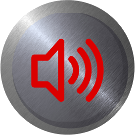
All the app needed to do was have an on/off mechanic and a volume control. I did something bold. Using three circles with a stock metal texture I varied the shadow and offset to create a button texture. Then I inverted the angle of the center circle and made it a lot darker with the effect of looking a bit like the button is pressed.
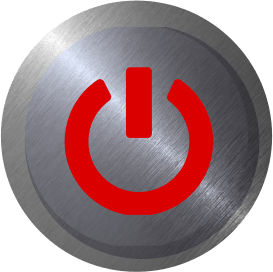
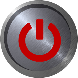
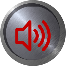
To distinguish between the on and off states I had the idea to have an active backlit centerpiece with two states … a default off and a bright green on graphic state.
To distinguish between the on and off states I had the idea to have an active backlit centerpiece with two states … a default off and a bright green on graphic state.

The same plastic-esque texture i used for the faceplate of the “readio” became the volume slider and the “blown up” and 90 degree turned backlight texture became the up and down red and green slider assets.

After I’d done all this work for the “love of the game” my friend decided he didn’t need an app and was just going to go with a simple tech addition to his station’s website. I was crushed. The project was shelved.
Recently, I revived the project. With the rise of vibecoding I was able to create a working mockup of the app the way I envisioned it all that time ago and the result is something I’m quite proud of for its quirky tony face and huge buttons, it’s cold steel and warm wooden home-good feel, and its ugly asymmetry and balanced contradiction.But it feels right and I’m proud of it.
This project was a labor of love, but it highlighted a critical lesson: even the simplest utility, like a radio app, benefits from a design language that feels tactile and human. Whether you’re looking to add a touch of personality to your app interface or need a UX overhaul, I’m currently opening slots for new projects.